
I have spent 20 years working with user experiences and interfaces. I have seen some well designed, easy to use interfaces and I have seen some awful interfaces that have been either visually disturbing or utterly unfathomable.
The challenge with many software developers is that there is little empathy towards users. This is a challenge way beyond the realms of Crestron software and is a challenge in so many areas of our lives.
Interfaces have to be frictionless, we do not want users to have to think 'how do I do that?', it should be clear to them what the next step is.
As the saying goes:
User interfaces are like jokes.
If you have to explain it, then it is a bad one.
Driven by being invited by a client to meet with their entire team to discuss what we think of their current interfaces and how to take the next step and improve everything; I have been thinking over what I did not like about that interface (in particular) and, more generally, what rules do I adhere to in order to create, what I hope are very intuitive and enjoyable user experiences.
I don't think these are anything revolutionary, but as I work with more interfaces developed by others, well, maybe they are.
Rule 1 - consistency
This is really the number one rule and could form an entire post by itself.
In order to deliver a visually pleasing interface, everything must be consistent throughout.
Colours.
Typography.
Button sizes and shapes.
Everything should be aligned and considered on the page.
I could write pages on consistency as I see so many examples of poor consistency.
Rule 2 - display what is being controlled
These days, there is hardly a system without an interface based around an iPad or iPhone (or Android equivalent) being used on the project.
There is probably nothing over the past decade that has changed our industry and our client's expectations more than the iPad.
One of the beauties of iPads is users can walk around the house and (with a well-managed wireless network) control any room in the property.
When a user enters a room and either selects the room, or has the room automatically selected for them (if there is location awareness being used on the project), the interface should always refresh to show what is going on in that new room - i.e. if Sky was already selected in the new room, the Sky controls should instantly be presented on the interface.
I have seen several times that the user selects the new room and the interface does not refresh and the user can be left looking at the controls for the source they selected in the last room they were in, so might be in a situation where Blu-ray controls are being presented even though Sky is on the screen.
Rule 3 - if it is not essential, remove it
Too many interfaces are cluttered with too many superfluous buttons and buttons that don't actually do anything at that time.
One of the beauties of a well-designed Crestron interface is that we can remove the buttons on the remote that really are not needed on a daily basis. Most remote controls have dozens of buttons that no user will need once the system is setup.
So, why have those buttons on your Crestron interface? Get down to the functions that users want and only those functions. If you, as the integrator, need to do some setup on the device, then you have to use the original remote, no big deal.
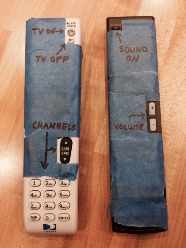
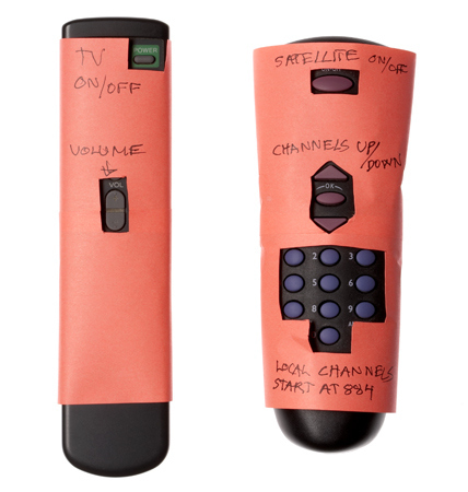
As some examples, I Googled 'Grandma remote controls' - they illustrate perfectly how few buttons are really needed in order to watch TV and change channels etc. They might be an extreme example, but they are a good starting point!

We go further than this with many areas of our interfaces.
If, in a particular circumstance, a button is not going to actually do anything, why not hide it away?
That's as simple as a power off button. Why display it when the power is off? Pressing it is not going to do anything.
When changing rooms, we see interfaces that leave all the options possible visible even if the option of, let's say, blind control is not relevant to that room. All of our interfaces are dynamic and react to the room selected to only show the functions and options that are relevent to that room (so if there are no blinds in the selected room, the blinds button will disappear).
Heating controls; if the heating is off, why not hide the setpoint adjust buttons (and sometimes even the setpoint itself)? The buttons won't do anything as the heating is off.
Many interfaces will display the volume feedback from the audio system, but then leave that volume bar on display when the user selects the TV (when the TV doesn't have true audio feedback available to us). Again, very unclear.
These simple concepts make for cleaner, more usable interfaces.
Rule 4 - make all the interfaces track each other
Again, this one seems so simple and straightforward, but we see many examples of multiple interfaces in a room that do not track each other (so selecting a source on an iPad doesn't change the page on an in-wall TSW screen, for example).
Twenty years ago, this was largely unavoidable. Many of the touchscreens we used were one-way devices, so we could not control what page was displayed on another panel.
But these days, we can control every aspect of an interface and having every interface in a room track each other is a fairly trivial matter.
It is not uncommon to have 2 or 3 interfaces in a room; an iPad, an in-wall touchscreen and a handheld remote control - they all need to track each other. Pressing a button on any of them needs to cause the other panels to update to show the correct source controls.
Rule 5 - why did it move?
This one ties into consistency really.
Most sources we control tend to have similar controls; a selection of transport controls, a cursor up/down/left/right/select, number pad and so on. Some have more, some have less, but very few video sources (in particular) have anything too different to that.
I believe it is important to ensure that those functions are always in the same place no matter which source you are controlling.
I have seen interfaces where, when watching Sky, the cursor controls are on the left of the screen, but then when watching Apple TV, they are on the right!
Those elements should always be positioned identically. The play button should always be in one location, the number pad in another.
Users should not need to look where to go, they should develop a memory path where it becomes instinctive where to head to reach the number pad.
It is not easy, and sometimes, along comes a source where suddenly you need 8 buttons in that section you really only designed for 6 buttons and you need to change button sizes and nudge some elements out of the way slightly. It's really easy to end up with that inconsistency, so I urge all developers to review their interfaces from time to time and ensure that nothing has moved.
Summary
Do I think I do anything revolutionary? Not really. But there are countless examples out there of interfaces that don't follow even these simplest of rules.
I have spent my entire working life observing how people interact with technology. The whole subject of ergonomics and user experience truly fascinates me and I hope that I apply my enthusiasm to create simple and frictionless interfaces that are focused on the user.
If you think I might be able to help you sort out interfaces you are not happy with, then please get in touch!